As a web designer, you have access to many tools that can help you create your website. This makes it easy for you to follow all the web design rules that are out there. But what if we told you that some of those rules might be holding you back? And what if we told you that breaking these rules could actually help your website look better?
These website design guidelines sound shocking at first, but wait until you see all the ways designers have chosen to break them! From dropping the grid system entirely and embracing asymmetry instead, to going bold with their backgrounds, we’ll show that sometimes breaking web design rules in the right way can make your site look great.
1. Drop the Grid System
Grid systems are incredibly useful for creating a visual hierarchy and sense of order, but they can also become restrictive. While some designers like to work within rigid grids in all aspects of their design, others choose to break the rules. By freeing yourself from the grid system altogether, you can create more interesting layouts that can help your site stand out from the crowd — and keep readers engaged with your content.
A great example of a designer who broke the rule of the grid system was David Carson, who used overlapping images, texts, and diagonal lines and became one of the most influential designers.

Source From: David Carson
So, sometimes breaking a rule may boost your creativity and help you stand out from the crowd.
2. Use Neumorphic Web Design
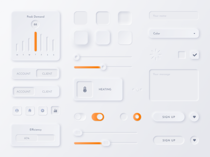
Neumorphic web design is a new trend in web design that looks at ways to create websites that are more intuitive and user-friendly. Designed to mimic the way a person interacts with objects in real life, it’s a great way to help users navigate your site without confusion or frustration.
In contrast to flat web design, neumorphic web design was initially created for the purpose of creating websites that mimicked the look and feel of print material. However, over time it has evolved into something more than just mimicking print materials. Nowadays, designers use neumorphic elements to create websites that mimic real-world objects, such as an office building or city street corner. This allows them to create more immersive user experiences by making them feel like they are actually inside these locations rather than just viewing them online.
It’s about using the common web design elements — the colours, shapes and textures to create an interface that feels organic and unique to your brand. It creates a simplified reality where buttons appear tactile.

Source from: Samson Vowles
The benefits of this web design style are the following:
- Increased visual interest on your site.
- A more immersive user experience because it makes you feel like you’re part of something bigger than just staring at text on a screen.
- Easier navigation because users will be more likely to recognize common patterns in the layout (such as navigation buttons).
3. Break the Rules of Consistency
One of the most common web design rules is consistency since this helps users feel comfortabe. But, many designers make the mistake of using the same simple template for each page of their website, no matter what kind of content they deliver. This way they harm the aesthetics of web design, by making the website appear boring and simple. Moreover, sometimes you need to use a different design for specific content. By breaking the rule of consistency, you can make your website seem unique and interesting. But, keep in mind that this doesn’t mean that you should make each page completely different, instead make your site unique while keeping some design elements consistent on every page, such as colour scheme or header.
Avoid making people feel like they visited a different website.
4. Embrace Asymmetry in Web Design
Another good web design principle is using symmetry in web design, but what if we want to break this rule? Asymmetry is a great way to make your website look more interesting. Instead of symmetrical images and elements, try balancing things out by using an unbalanced layout. You can use asymmetry in the colour scheme, typography, or even the content itself.
For example, if you have a lot of text on one side of the screen (the right), then leave some space for other things on the left side of that same screen (or vice versa). This will help break up the monotony and make your design feel less boring.

Source from: Cargocollective.com (Christel Winther)
5. Use Multiple Fonts
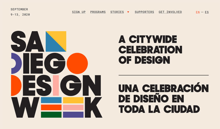
One of the web design rules is using one or two fonts, instead of multiple ones. However, sometimes you can actually break this rule and choose multiple fonts which are essential web design components. There are plenty of websites that have a lot of text and a single font, which is boring and unoriginal.
To get the most out of your designs, you can choose different fonts that complement each other well rather than having them compete with each other visually. You will also want to make sure that the typeface you choose is easy-to-read when it comes down to size or colour.
Digi-Tip: Use multiple fonts when your website design is text-oriented.

Source from: Pinterest
6. Use the Same Colour Base for the Text and Background
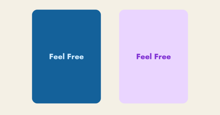
Another infamous web design rule is not to use the text and background in the same colour, because the text will not be visible. But, many designers misunderstand this point and don’t use colours in the same colour spectrum, because they think that customers won’t be able to read the text. You can actually use text that has the same colour base that the background in a way that it’s readable and smooth.
For instance, you can achieve unity on your website, by using a dark background and bright texts that are both from the same colour family. Or if you want to create that sense of 3D, you can use a lighter background with darker text. See the picture below!

Digi-Tip: Always check the colour psychology in web design before deciding the colour of your text and background so that it aligns with your brand’s mission.
These were the rules that you can break, but always check if customers will understand your unique approach before making it go live. If you wonder how to design a web app, Digilite’s creative team provides branding services and is always ready to guide you through the web design process. Don’t hesitate to contact us!


