
![Web Design Elements & Principles That Still Matter [Updated 2026]](https://digilite.ca/wp-content/uploads/2023/02/ChatGPT-Image-Jul-3-2026-04_20_08-PM.png)
Web design has changed a lot since websites were mostly static pages with basic layouts. In 2026, a strong website needs to do more than look modern. It should load quickly, work smoothly on mobile, guide visitors clearly, support accessibility, and help your brand show up across search engines and AI-powered discovery tools.
That is why understanding web design elements and principles still matters. Trends change, but the foundation of effective design remains the same: clarity, usability, structure, consistency, and purpose.
Today, the best websites combine thoughtful web design elements, strong UX, fast performance, accessibility, and conversion-focused decisions. Whether you are building a new website or updating an existing one, the right design can make the difference between a site people visit and a site people trust.
What Is Web Design Today?
Web design is the process of planning, structuring, and designing a website so users can understand, navigate, and interact with it easily. It includes visual design, user experience, content layout, mobile responsiveness, accessibility, performance, and conversion flow.
In 2026, good website design elements are no longer limited to colours, fonts, and images. They also include:
- Navigation structure
- Page speed
- Mobile usability
- Accessibility
- Content hierarchy
- Trust signals
- Interactive features
- Clear calls-to-action
- Search-friendly page structure
For businesses that want a stronger digital presence, strong web design and development should work together. The design should guide users clearly, while the development should support speed, responsiveness, security, and long-term scalability.
Figma’s web design trend insights highlight immersive visuals, bold typography, motion, AI-driven experiences, and sustainable web design as key directions. However, these trends work best when they support usability instead of distracting from it.
Why Web Design Principles Still Matter
Trends can make a website feel fresh, but web design principles make it usable. A bold visual style may catch attention, but if users cannot find your services, read your content, or take the next step, the design is not doing its job.
The core principles of web design help every page feel organized and intentional. They guide how content is arranged, how users move through the website, and how visual elements support the message.
The following are the key principles that web designers should adhere to:
- Balance: keeping the page visually stable
- Contrast: helping important elements stand out
- Hierarchy: guiding users through the content
- Alignment: creating a clean, consistent layout
- Proximity: grouping related information together
- Consistency: keeping pages connected to the same brand
- Accessibility: making the site easier for more users
- Performance: keeping the experience fast and smooth
These principles help a website feel professional, clear, and easy to use.
Key Web Design Elements Every Website Needs
Strong elements of web design help users understand who you are, what you offer, and why they should take action. These are the building blocks that shape the full website experience.
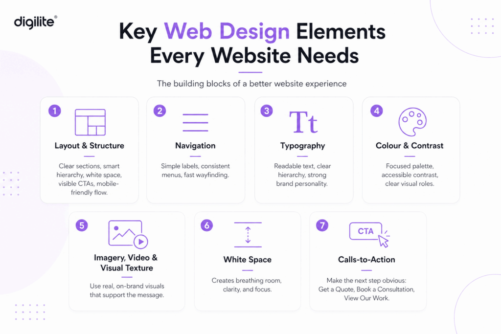
1. Layout and Structure
Layout is one of the most important design elements of a website because it determines how information is organized. A good layout makes the page easy to scan and helps users move naturally from one section to the next.
A strong layout should:
- Place key information near the top
- Use clear sections instead of long text blocks
- Keep enough white space around content
- Make CTAs easy to find
- Work well on desktop and mobile
Modern websites often use modular layouts, card-based sections, split screens, and flexible content blocks. These elements of web page design make websites easier to update while keeping the experience clean and organized.
This becomes especially important in industries where products are visual, customizable, or difficult to explain through text alone. For example, a soundproof office pod brand approached our team with a need for a more engaging product-focused website that could help users explore different pod options, understand customization possibilities, and take action without confusion. To solve this, the website experience was built around clear product pages, structured content blocks, colour selection options, custom colour requests, and product-level contact forms. These design decisions supported important web design principles such as hierarchy, usability, consistency, and conversion-focused structure, making the browsing experience more practical for users and more effective for the business.
Brands like Apple demonstrate how powerful layout and structure can be when used intentionally. Apple’s website uses modular sections, strong visual hierarchy, and generous white space to guide users through product stories without overwhelming them. Each section feels focused, making it easier for users to understand features, compare options, and move toward a purchase decision.
2. Navigation
Navigation is one of the most practical website elements because it helps visitors find what they need quickly. If people have to think too much about where to click, they are more likely to leave.
Good navigation should be simple, descriptive, and consistent. Use clear labels like “Services,” “Projects,” “About,” “Blog,” and “Contact” instead of vague or overly creative wording.
For service-based businesses, navigation should also support conversion. Important pages should not be hidden several clicks deep. Users should be able to understand what you do within seconds.
3. Typography
Typography is more than choosing a nice font. It affects readability, hierarchy, mood, and brand personality.
As part of your design elements for websites, typography should make content easy to read across all devices. Headings should clearly separate sections, body text should be comfortable to scan, and font weights should guide attention without overwhelming the page.
Bold typography is still popular in 2026, but it should be used with intention. Large headings can create impact, but the main content still needs to be readable and accessible.
4. Colour and Contrast
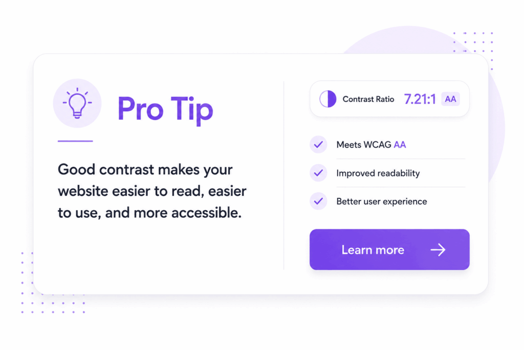
Colour shapes emotion, brand recognition, and user behaviour. It can highlight buttons, divide sections, create mood, and help visitors understand what matters most.
The best website design elements use colour strategically. Instead of using too many colours, build a focused palette with clear roles:
- Primary brand colour
- Secondary accent colour
- Background colours
- Text colours
- CTA colour
- Error and success colours for the form
Contrast is especially important for readability and accessibility.
5. Imagery, Video, and Visual Texture
Images, illustrations, icons, and videos help communicate your brand faster than text alone. They can explain services, show results, build trust, and make a website feel more memorable.
In 2026, visual trends are moving toward expressive, human, and layered design. However, visuals should never slow the site down or distract from the main message. Good web design elements should support the user journey, not compete with it.
Use visuals that:
- Show real work, people, products, or results
- Match your brand style
- Load quickly
- Include alt text
- Support the message of the page
- Avoid generic stock-photo overuse
In product-based industries, visuals often carry much of the user experience. When customers need to understand size, style, colour, materials, or customization options, the website should do more than display basic product photos. In one product-focused website project, our team used AI-generated visuals to create a polished and consistent look while still supporting the real purpose of the website: helping users explore the products clearly and confidently. This shows how visual design can support both branding and usability when it is used with intention.
Nike is a strong example of how imagery and motion can elevate user experience. Its website uses bold visuals, dynamic product photography, and subtle animations to create energy while still keeping the shopping journey clear. This balance between visual impact and usability helps users stay engaged without losing focus on the product.
6. White Space
White space is one of the most overlooked elements of website design strategy. It gives content room to breathe, improves readability, and helps users focus on what matters.
A cluttered website often feels confusing, even if it looks creative. White space creates rhythm and helps CTAs, headings, images, and key messages stand out.
7. Calls-to-Action
A website should always make the next step clear. That next step may be booking a consultation, requesting a quote, reading a case study, downloading a guide, or contacting the team.
CTAs are essential web page design elements because they connect design to business goals. A good CTA should be visible, specific, and action-focused.
Instead of generic buttons like “Submit,” use clearer options such as:
- Get a Quote
- Book a Consultation
- View Our Work
- Start Your Project
- Talk to Our Team
How to Design a Homepage That Makes a Strong First Impression
Your homepage is often the first place people go to understand your business. Strong homepage design principles help users quickly answer three questions:
- What does this company do?
- Is this relevant to me?
- What should I do next?
A high-performing homepage should include:
- A clear hero message
- A short value proposition
- Simple navigation
- Key services or solutions
- Client logos, testimonials, or case studies
- Clear CTAs
- Fast mobile performance
The homepage should not try to say everything. Its job is to guide visitors to the right next page.
Tesla’s homepage is a strong example of clarity and focus. It uses minimal text, bold visuals, and clear calls-to-action to guide users toward exploring vehicles or booking a test drive. This approach shows how simplifying content can improve decision-making and reduce friction in the user journey.
Mobile-First Design Is No Longer Optional
Mobile-first design means planning the mobile experience before expanding to desktop. This matters because users often discover businesses through mobile search, social media, paid ads, referrals, and AI-generated recommendations.
Good mobile design should include:
- Tap-friendly buttons
- Shorter sections
- Clear spacing
- Fast-loading visuals
- Easy-to-read text
- Simple menus
- Forms that are easy to complete
Mobile-first design also forces better prioritization. With limited screen space, every section has to earn its place.
Performance and Core Web Vitals
A visually impressive website can still fail if it loads slowly or feels unstable. Performance is now a major part of modern web page design principles.
To improve performance:
- Compress images
- Avoid unnecessary animations
- Limit heavy scripts
- Use modern image formats
- Reduce third-party plugins
- Keep fonts optimized
- Test pages regularly
The goal is not to remove creativity. The goal is to make creativity work without hurting usability.
Accessibility as a Design Standard
Accessibility should be part of the design process from the beginning, not something fixed after launch.
Accessible web design elements include:
- Strong colour contrast
- Keyboard-friendly navigation
- Descriptive links
- Alt text for meaningful images
- Clear form labels
- Visible focus states
- Readable font sizes
- Logical heading structure
Accessibility also supports trust. A website that is easier to use feels more professional, inclusive, and reliable.
AI-Era Search and Website Structure
Search behaviour is changing. Users are not only typing keywords into Google. They are also asking AI tools for recommendations, comparisons, and summaries.
This does not mean traditional SEO is gone. It means your website needs to be structured clearly enough for both people and search systems to understand.
A strong website design elements strategy should include:
- Clear headings
- Direct answers to common questions
- Organized service pages
- Helpful blog content
- Schema markup where relevant
- Internal links between related pages
- Trust signals and real examples
- Easy-to-read formatting
AI search visibility starts with clarity. If your website explains your services well, structures information clearly, and builds credibility, it becomes easier for search engines and AI systems to understand your brand.
AI search visibility starts with clarity. If your website explains your services well, structures information clearly, and builds credibility, it becomes easier for search engines and AI systems to understand your brand. This is also where generative engine optimization can support your website strategy by helping your content become easier for AI-powered search tools to understand, summarize, and recommend.
Modern Web Design Trends Worth Using in 2026
Not every trend belongs on every website. The best approach is to choose trends that match the brand, audience, and business goals.
Some 2026 trends worth considering include:
- Bold typography for stronger brand presence
- Subtle motion for smoother storytelling
- Tactile textures and layered visuals
- AI-assisted personalization
- Conversational interfaces
- Sustainable, lighter websites
- Interactive service explainers
- More human, less generic imagery
The key is restraint. A trend should improve the experience, not become the experience.
Before You Go
The strongest websites in 2026 are not built by chasing every new trend. They are built by combining timeless web design principles with current user expectations, accessibility standards, mobile-first thinking, performance, and clear content structure.
Your website is often the first serious interaction someone has with your brand. Make it easy to understand, easy to use, and easy to trust.
When the right content strategy, UX decisions, and development practices work together, your website becomes more than a digital brochure. It becomes a business tool that supports visibility, credibility, and growth.
Frequently Asked Questions
1. How often should a website design be updated?
A website should be reviewed regularly and refreshed when it feels outdated, loads slowly, or no longer supports your business goals.
2. What makes a website feel trustworthy to visitors?
Clear messaging, professional design, fast loading, testimonials, case studies, easy navigation, and visible contact options all help build trust.
3. Why is mobile-first design so important today?
Many users visit websites from phones, so the mobile experience needs to be fast, simple, readable, and easy to use.
4. Can too many visuals hurt website performance?
Yes. Large images, heavy videos, and too many animations can slow the website down and worsen the user experience.
5. How does accessibility improve the user experience?
Accessibility makes a website easier for more people to read, navigate, and use, including users with visual, mobility, or cognitive needs.