Sable Metal Fabrication
Sable Metal Fabrication was founded in 2004 with the sole purpose of laser cutting. They were so successful in this area that their customers asked them to extend their services. Now, besides laser cutting, the company also provides forming (bending), and other services. They keep their competitive advantage by investing in the most cutting-edge technologies, both in terms of machines and software.
To maintain its competitiveness not only in terms of technology but also in current marketing trends, Sable needed branding, logo design, web design, and website development. And that is precisely when our collaboration with Sable began.
Branding
Sable Metal Fabrication was founded in 2004 with the sole purpose of laser cutting. They were so successful in this area that their customers asked them to extend their services. Now, besides laser cutting, the company also provides forming (bending), and other services. They keep their competitive advantage by investing in the most cutting-edge technologies, both in terms of machines and software. To maintain its competitiveness not only in terms of technology but also in current marketing trends, Sable needed branding, logo design, web design, and website development. And that is precisely when our collaboration with Sable began.
Our first step was branding, which shapes the way people perceive and recognize a brand. It’s about who you are as a business. When done correctly, branding can help companies increase brand value, reach new customers, improve client satisfaction, and establish trust. We tasked our designers with creating a unique brand image that reflected the company’s value and essence. We knew how essential and critical logo design was for the company’s success. For that reason, we collaborated closely with our design team to create a logo that complements the overall brand. We chose a black and white colour scheme to build a professional and modern brand image. Our logo was more pristine, cleaner, and minimalistic than the prior logo design. We’ve designed a pictorial mark in which the logo's abstract geometric form represents 'horse' in a really unique way. The colour and form of our choice symbolize what the firm does, adding meaning and cultivating emotions.
Website Redesign
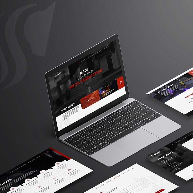
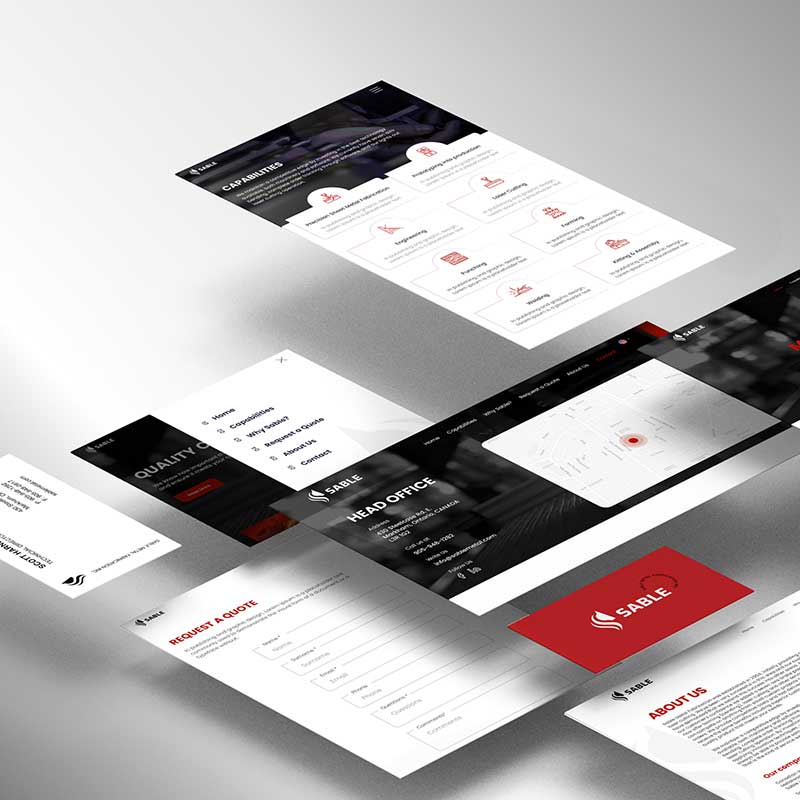
After branding and logo design, we’ve decided to redesign the website in a way that it reflects the metallic style of the company. We strived for a clean, well-structured, and pristine web design. Our goal was to create separate web pages that would help viewers easily find the offered services. We’ve made the call-to-action visible with the eye-pleasing and catchy red colour. The latter was used on areas of the webpage that needed particular attention. The design that we’ve created is modern, appealing, and slick with a combination of white and black colours, which represents simplicity, but also clarity and power. We’ve combined this with clean typography to show the company’s reliable and stable nature. Through font size, typography, colours, and well-organized information architecture, we’ve created a straightforward hierarchy to make the website easily navigable.

WordPress Web Development
And the website with its branding, logo design, and web design couldn’t come to reality without web development. Since WordPress offers new chances to employ simple interfaces while modifying them appropriately, our development team decided to use it to construct the website from the bottom up. We’ve developed a responsive and mobile-friendly website for the business, taking into account the brand’s image. We’ve put the menu bar in the upper right corner, which turns red once the visitor hovers over the buttons. To make it even simpler for the user to browse the website and identify the required services, we included relevant high-quality images. On the middle right side, we’ve put the services so that the users will click on them and get some information about the services. We’ve included a ‘read more’ button so that people may click it and go to the specific page.

“SABLE WANTED TO HAVE A CLEAN, INVITING, AND PRISTINE LOGO DESIGN, BRANDING, AND WEBSITE, AND OUR TEAM OF DIGITAL MARKETING SPECIALISTS CERTAINLY DELIVERED.

