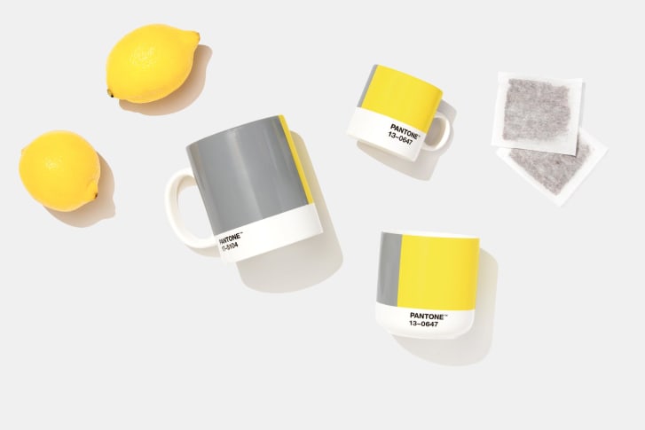
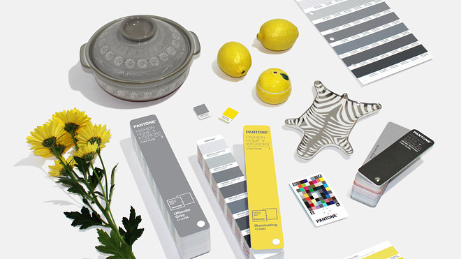
Pantone’s Color of the Year for 2021 is here, and there is not one but two colors featured for this year – Ultimate Grey (PANTONE 17-5104) and Illuminating (PANTONE 13-0647). The combination of grey and yellow offers an ideal balance of practicality and warmth. Apart from aesthetics, what significance does Pantone’s color of the year have for business owners though? In fact, Pantone’s Color of the Year has been inspiring and influencing decisions of producers and consumers alike across several industries, such as graphic design, home furnishing, fashion, product development, and more. There are many ways you can incorporate the colors of the year for 2021 into your business and notice remarkable differences.
Significance of Color
“A message of happiness supported by fortitude, the combination of PANTONE 17-5104 Ultimate Gray + PANTONE 13-0647 Illuminating is aspirational and gives us hope. We need to feel that everything is going to get brighter – this is essential to the human spirit.” – Leatrice Eiseman, Executive Director of the Pantone Color Institute

Many may not give significant attention to Pantone’s Color of the Year announcement, believing it does not hold much importance. However, the Color of the Year is chosen with global expression in mind and takes inspiration from the events in the world from culture to politics. Anyone who works first-hand with colors knows the power it holds of transmitting emotions and moods to the receiver.
Digi-tip: The graphic designers at Digilite recommend paying immaculate attention to color theory before creating even the smallest details. If colors clash then your entire design will fall apart.

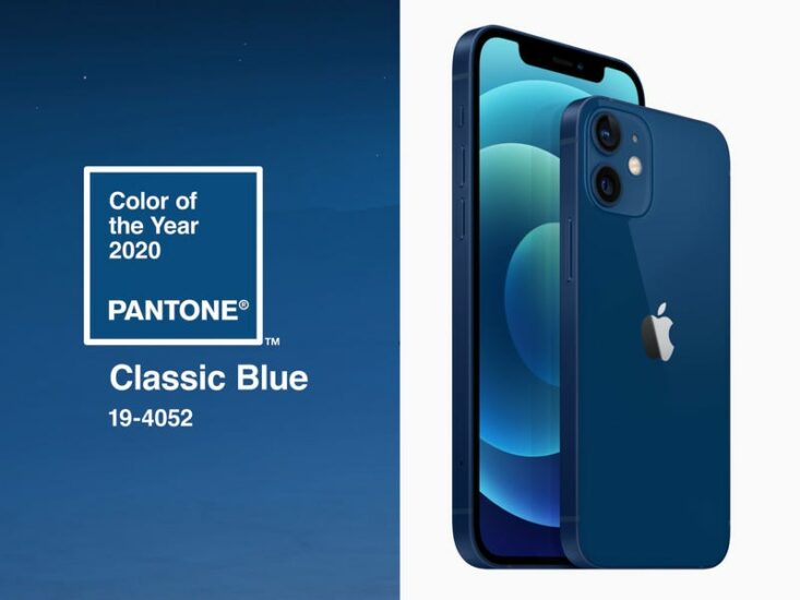
The Color of the Year is present in more places than people will always be aware of and its most notable implementation is in merchandising. A prime example of 2020’s Color of the Year — Classic Blue — was Apple’s release of the iPhone 12 in the exact shade. It is now no surprise that this new model caught the attention of many buyers whether they realized this new release corresponded to the Color of the Year or not. Apple shrewdly incorporated Classic Blue in their product development which blended seamlessly with their existing line of products.
Tactful Implementation

Incorporating the Color of the Year in your business must be done strategically, though. It is important to keep in mind that the color(s) should not overpower your already-established branding. A new color is announced every year, and if businesses completely redirected their company branding each year along with it, then this would defeat the purpose of companies having a brand identity. As seen with Apple’s example above, they added value with their implementation of Classic Blue without letting it affect their overall branding. Let’s look at a few areas you can include the Ultimate Grey and Illuminating color scheme this year varying by industry:
- Merchandising companies can create a product in this color swatch.
- Fashion designers can highlight these colors with their respective fabrics and patterns.
- Graphic designers and digital producers can offer templates or graphics which are ready-to-use with emphasis on grey and yellow.
- Ultimate Grey and Illuminating Yellow will be vastly present in interior design, hence it is optimal to use as accent colors for decorative pieces.
Digi-tip: Don’t only think in terms of dominant colors; accent colors must be hand-picked as well when incorporating the Color of the Year in your design. Envision how it will coexist with other colors.
Highlighting the Existing

You may be wondering about the situation when the predominant colors of the business’ branding coincide with the chosen Color of the Year. This scenario was quite common with 2020’s Classic Blue since it was already present among endless brands. In this case, it is the ideal time to review your branding choices and ensure to highlight the color more than ever. Whether it was a primary or secondary color in your branding, bring it forward and under the spotlight. There are various ways you can do this, especially in digital marketing, such as:
- Creating blog post feature images with this color,
- Including it in social media posts and promotional materials,
- Adding the color to reports, brochures, and flyers,
- Reviewing the color’s presence on your website and logo.
Besides digital implementation, since the color is already an indicator of your brand identity, bring it forward in the material world as well. This includes and is not limited to using the color at events you are hosting, in staff uniforms, corporate gifts, and more. The options are endless, but remember to carry this out tastefully by still using your complimentary and secondary colors to avoid overwhelming your brand with one color.
Summing Up
Pantone’s Color of the Year announcement is one you should look forward to, instead of disregarding, no matter the industry you work in. Explicitly or implicitly, incorporating the colors for 2021 — Ultimate Grey and Illuminating — has the potential to attract new waves of consumers to your business based on the workings of color psychology. Start strategizing towards tactful implementation of these colors in various outlets of your business while still maintaining your strong, individual brand identity!
Digilite’s graphic designers are here for all of your branding or rebranding needs. Contact us today to kickstart your next design project!


