Clean ON
Based in Toronto, Clean ON is a high-end cleaning and organizing business that provides customized services to satisfy customers. The company is dedicated to providing luxury cleaning services and turning residential and commercial spaces into showcases.
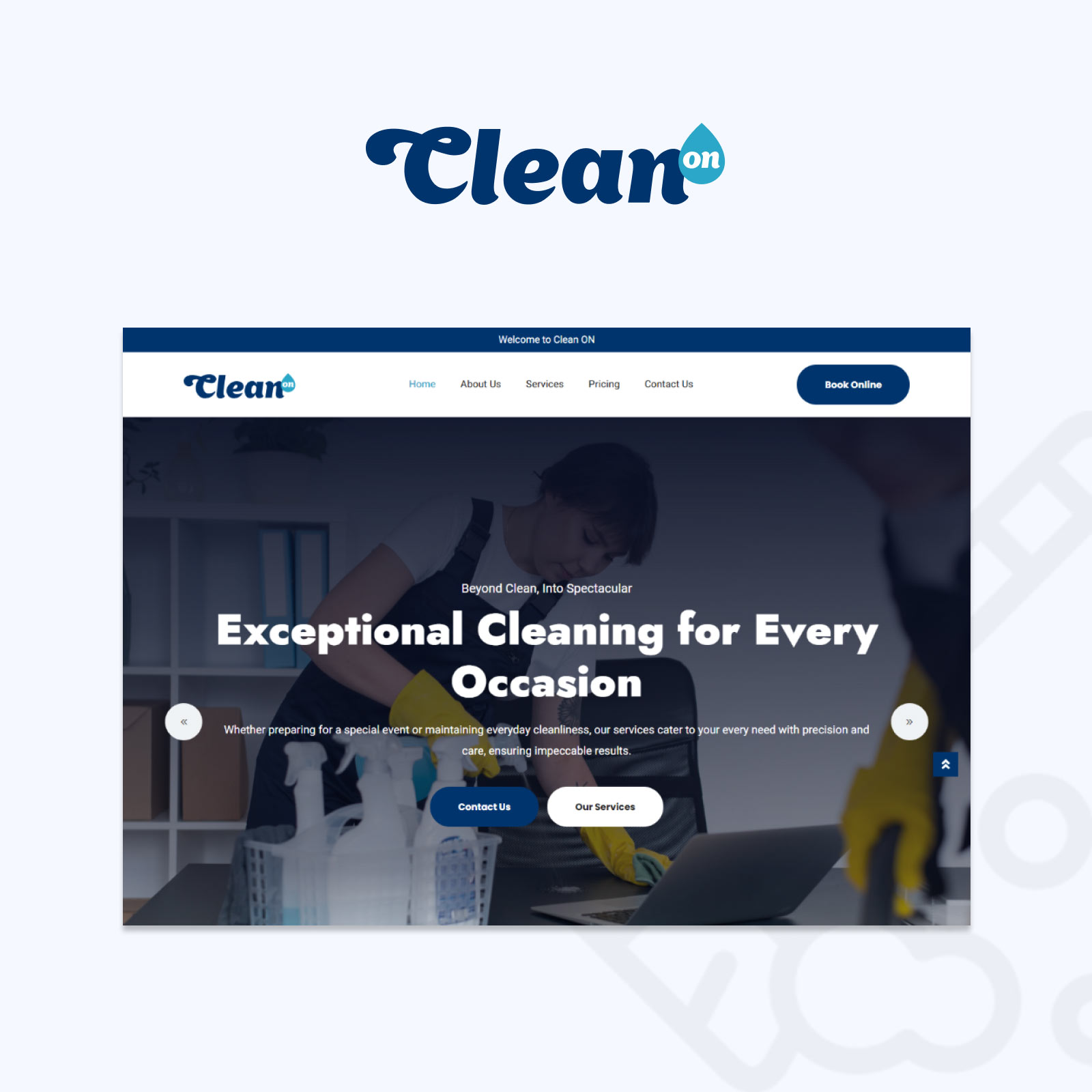
They contacted us to modernize their website and strengthen their brand identification to better showcase their upscale offerings. We aimed to make it simpler for clients to browse and schedule services online, providing them with a modern platform that matches the sophistication and attention to detail they offer in their services.

Web Development
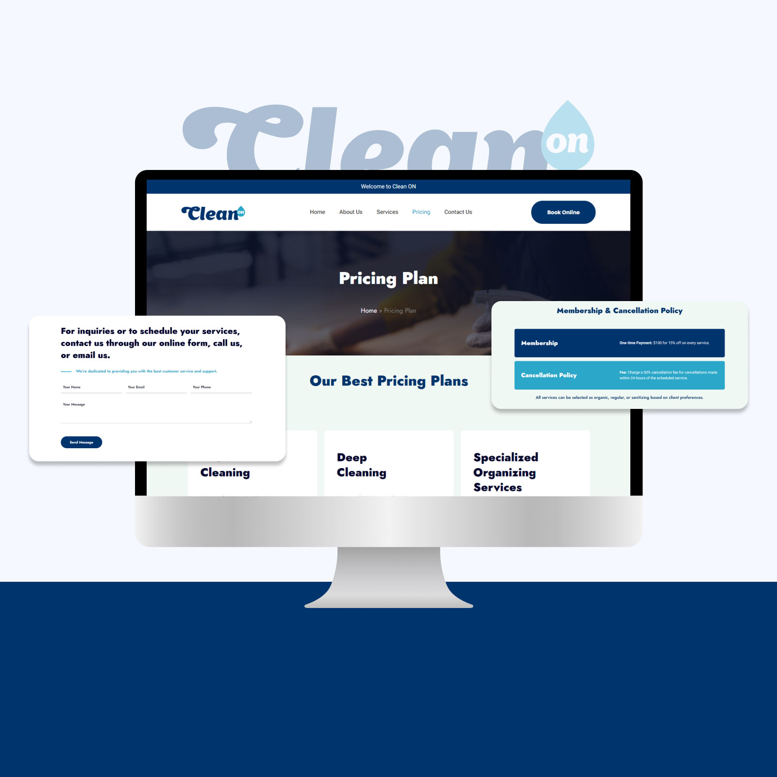
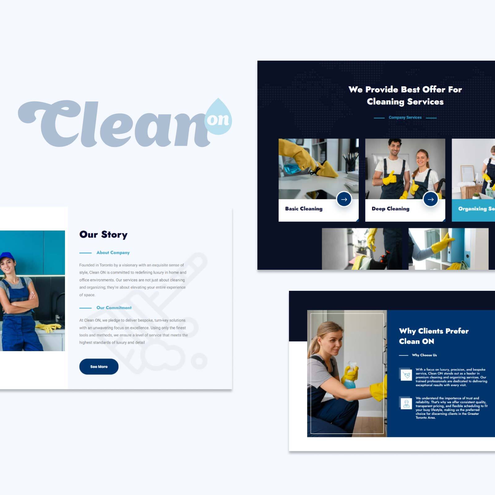
The Clean ON website was built to ensure a quick and cost-effective solution. However, we fully customized the site by updating all images and matching the content to their sitemap, ensuring that every detail aligned with their brand identity. We also integrated features like Calendly, allowing clients to easily book appointments, and optimized the site for seamless navigation across devices. The website reflects Clean ON’s commitment to quality, presenting its services in an elegant and accessible way.
The website was responsively optimized, guaranteeing seamless operation and navigation on PCs, tablets, and smartphones simultaneously. From thorough explanations of offers to an interactive contact form, every component was created to improve customer interaction and enable simple access to Clean ON's services. From thorough explanations of offers to an interactive contact form, every component was created to improve customer interaction and enable simple access to Clean ON's services. The outcome is an aesthetically beautiful and incredibly useful website that precisely reflects Clean ON's dedication to quality and brand identification.

Branding
Our team developed full branding for Clean ON, focusing on a sleek and modern look that reflects the company’s luxury image. We designed the logo to incorporate a drop icon, symbolizing cleanliness and purity, with a clean and elegant font. The colour palette was chosen to convey sophistication and reliability, featuring navy blue with white and light blue accents.
This branding was applied across all company materials, including uniforms, cleaning products, business cards, and digital assets, creating a cohesive and professional look that aligns with Clean ON’s premium services. Clean ON is able to portray itself as a high-end service provider in each and every encounter with customers by upholding consistency in the visual identity. Their audience is left with a lasting impression by the redesigned identity, which also strengthens their position as a leader in upscale cleaning services.
