How often do we find ourselves instinctively drawn to certain elements of a website, while completely overlooking others? This is not mere chance, but a direct result of selective attention, a critical factor in digital marketing and design. Understanding and using this concept is not just beneficial, it’s essential for success.
This blog aims to explore the intricate relationship between selective attention and its profound impact on both web design strategies and marketing efforts, offering a comprehensive view of the psychology and practical applications that define this dynamic.
Diving into the Psychology of Selective Attention
Selective attention is a basic psychology concept that describes how our brains pick out and concentrate on particular environmental cues while disregarding others. This idea is essential to understand how we make our way through the deluge of information we come across daily, particularly in the digital age.
Selective attention, a key focus in psychology for over a century, has been shaped by several groundbreaking theories. Donald Broadbent’s 1958 Filter Model compared the mind to a switchboard, filtering information early and allowing only specific stimuli for processing. Anne Treisman modified this in 1964 with her Attenuation Theory, suggesting the mind weakens, but doesn’t entirely block, unattended stimuli, thus processing them partially. Daniel Kahneman, in 1973, introduced the Capacity Model, viewing attention as a finite resource, distributed based on task demands and cognitive capacity. Together, these theories offer a comprehensive understanding of how we selectively process the vast information around us.
Modern research in cognitive psychology and neuroscience continues to expand on these foundational theories, exploring how selective attention is influenced by factors like motivation, alertness, and individual differences. Neuroscientific studies, for instance, have identified specific brain regions and neural networks involved in the process of selective attention.
The Power of Selective Attention in the Digital Age
Selective attention is our cognitive gatekeeper, deciding what information makes it through the crowded digital landscape to our conscious awareness. In a world where an average person is bombarded with between 6,000 to 10,000 ads every day, the ability to cut through the noise and capture user attention is not just valuable; it’s imperative for any successful marketing and design strategy.
As users navigate through websites, social media platforms, and various digital mediums, they subconsciously prioritize information based on relevance, visual appeal, and personal interest. This selective process is not merely about focusing on a single element but involves the complex interplay of ignoring irrelevant data while honing in on what matters most.
Selective attention in marketing means creating content that resonates not just visually but contextually with the target audience. Effective use of visual cues, persuasive copywriting, and strategic positioning of key messages are essential. The aim is to make the most significant impact with the minimal cognitive load on the viewer. Additionally, this selective attention paradigm shifts the focus from quantity to quality in content creation.
Furthermore, selective attention underscores the importance of user experience (UX) in design. A well-designed interface that aligns with how users naturally process information can significantly enhance engagement and interaction. Elements like navigation ease, readability, and intuitive layout become not just aesthetic considerations but psychological tools.
Gestalt Principles in Design and Marketing
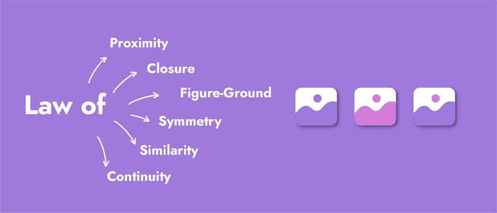
Gestalt principles, crucial in psychology, play an important role in both design and marketing by influencing how users perceive and interact with visual elements. These principles, when skillfully applied, can significantly enhance user experience and engagement.
- Law of Proximity: This principle implies that elements placed close together are perceived as related. In design, this means creating a layout where related items are grouped, leading to a cleaner and more intuitive interface. In marketing, this grouping can subtly encourage consumers to associate certain products or messages together, enhancing the impact of the campaign.
- Law of Similarity: Objects that are similar in appearance are perceived as part of the same group. In design, maintaining a consistent style with colours, typography, and images creates a cohesive user experience. For marketing, this similarity can be used to strengthen brand identity, making marketing messages more recognizable and memorable to the audience.
- Law of Closure: Our brains tend to fill in gaps to create a complete image. Designers use this to create intrigue and engagement through partially completed designs that invite users to interact. In marketing, leveraging this principle can create compelling and memorable ads that encourage consumers to think about and engage with the brand.
- Law of Symmetry: Symmetrical designs are perceived as harmonious and balanced, contributing to a positive user experience. In marketing, symmetry can be employed to create aesthetically pleasing layouts that convey professionalism and trustworthiness, thereby enhancing brand perception.
- Law of Continuity: This principle states that elements aligned on a line or curve are seen as more related than those that are not. In design, this can guide the user’s eye through a website or interface in a fluid, logical manner. In marketing, using this principle helps direct attention to key messages or calls to action, increasing their effectiveness.
- Law of Figure-Ground: This involves distinguishing between the ‘figure’ (the focused element) and the ‘background’. Effective use of this principle in design improves readability and focus. In marketing, it helps highlight key products or offers, making them stand out amidst other content.

Selective Attention in Design
In this field that combines UX design and psychology, the application of selective attention principles is crucial for crafting user experiences that are both engaging and efficient. Here’s how key principles of selective attention are applied in UX design:
- Visual Hierarchy: Visual hierarchy is a technique used by designers to direct the viewer’s attention to particular parts of the work. Designers can influence the sequence in which elements are noticed and processed by the user by adjusting elements’ size, colour, contrast, and placement.

- Use of White Space: White space, or negative space, plays a crucial role in reducing cognitive load in UX design. It makes the content more legible and the overall user experience more comfortable by providing a restful area for the eyes, preventing information overload and aiding in better comprehension and retention of on-screen content.

- Colour and Contrast: Colour and contrast are essential in UX design for attracting and maintaining user attention. High-contrast elements highlight key areas and enhance the readability of text and imagery. Colours can also evoke specific emotions or reactions, influencing user behaviour.

- Typography: The choice of typeface, along with its size, spacing, and arrangement, is crucial in how information is perceived and processed. In UX design, typography is not just about aesthetic appeal but also about improving readability and guiding the user’s selective perception of important information.

- Focal Points and Visual Cues: Designers create focal points and visual cues to intuitively guide the viewer’s eye toward important information or actions. These cues act as navigational aids in the design, helping users focus on key elements.

- Responsive Design: With a variety of device sizes and screen resolutions, responsive design ensures that key design elements maintain prominence and functionality across different platforms, adapting to the user’s device for optimal viewing and interaction.

- Microinteractions and Personalized Design: The user’s attention is maintained through the usage of individualized design components and microinteractions. The whole experience is improved by these minor interactive elements, which also make the system more user-friendly and personalized.

By understanding and applying these principles from psychology, particularly those related to how users process and prioritize information, UX designers can create more engaging, intuitive, and user-friendly interfaces.
What is Selective Attention in Marketing
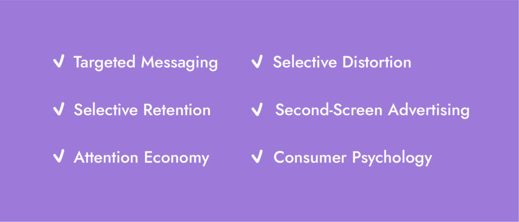
Selective attention in marketing focuses on crafting messages and strategies that resonate with the target audience’s interests, needs, and values. Key aspects include:
- Targeted Messaging: Marketers ensure that their messages stand out among the deluge of advertisements by crafting them to coincide with the audience’s requirements and interests.
- Selective Distortion: Understanding that consumers interpret information based on their existing beliefs, marketers tailor their messages to fit these perceptions, enhancing brand alignment and message effectiveness.
- Selective Retention: In considering how values and attitudes affect the selective attention process, marketers focus on creating memorable content that aligns with the audience’s values and beliefs. This alignment increases the likelihood of the message being retained and acted upon.
- Second-Screen Advertising: Because using multiple devices is so common, marketers create tactics to engage customers on multiple devices at once, increasing the reach and effectiveness of their efforts.
- Attention Economy: Marketers concentrate on developing distinctive, contrasting components in their campaigns to grab and hold consumer attention in a world where attention is a valuable resource.
- Consumer Psychology: To create marketing strategies that connect with the audience more deeply and result in campaigns that are more powerful and impactful, it is essential to comprehend consumer behaviour and psychology.

Marketers can design campaigns that strongly resonate with their target audience and catch attention at the same time, increasing engagement and conversion rates, by concentrating on these elements of selective attention.
In understanding the dynamics of selective attention, the integration of specialized UX design services becomes essential, not only for optimizing interfaces but also for crafting effective digital campaigns. These tailored solutions meticulously enhance interfaces, incorporating principles like visual hierarchy, white space utilization, and responsive design. Aligned with users’ information processing, this approach ensures digital platforms offer seamless engagement and navigation through the cluttered digital landscape, contributing to the success of digital campaigns.


