No landing page is designed for the sake of sheer existence. Just as all customer touch points, landing pages are made to implement certain functions – be it triggering a certain action, educating the users, or notifying them about something. Taking this into account, both interface designers and marketers should be strategic when designing landing pages.
They should make sure to direct the target audience’s attention to the points that are crucial for the achievement of the page’s objectives.
While smart information architecture and content are the main tools in the designers’ toolkits, understanding certain aspects of neuroscience can help designers enhance the effectiveness of their designs just with more careful choice of visual patterns.
The human brain has a specific way of processing information. Two brain areas that determine the way our brains process visual information are the fusiform facial area (FFA) located near the amygdala, in the mid part of the human brain and the “pre-attention areas of the visual cortex. Understanding the specifics of these areas, designers may come up with visual solutions that are utterly effective in the sense that they trigger the desired actions.
Fusiform Facial Area (FFA)

The name of the fusiform facial area (FFA) derives directly from its function. The FFA identifies if the object at which a person is looking is a face. Afterward, it proceeds to identify if it is a familiar face. The third step is understanding if the face is of someone that the viewer knows personally. The final step is determining the emotion/feeling of the face. Just because human brains have a region dedicated specifically to face recognition, using faces in interfaces is a proven way of attracting a user’s attention
To stimulate the FFA, designers can use the following:
- A large face, facing forward: faces that look straight out simulate the region. This makes humans stop and ponder, which is essential if the designers want the user to think about the piece of information that he/she has included in the page content.
- Face that looks at a specific object: The research reveals that the spectator’s eye gaze follows the eye gaze of the face portrayed in a photo. This does not necessarily imply that people take action – if the call-to-action is not explicit enough, no action will follow. However, this can be a wise design choice when combined with clever content.
- The face that shows a strong emotion: If the eye gaze did not work, the incorporation of a face with a highly emotional expression may bring to the desired outcomes. Emotional faces are useful for creating tension and triggering particular emotions in the spectator’s mind. For instance, an e-commerce landing page that is aimed at selling a backache cream may use a suffering face to convey the pain. Combining this with an actionable call-to-action may result in immediate conversion
Interestingly enough, even inanimate objects that have components resembling facial features (e.g. a cookie that looks as though it has human eyes and a mouth) may stimulate the FFA area. On the other hand, faces that are in profile may be slow to stimulate the fusiform facial area. Hidden or obscured faces do not stimulate the region at all.

“Pre-Attention” Areas
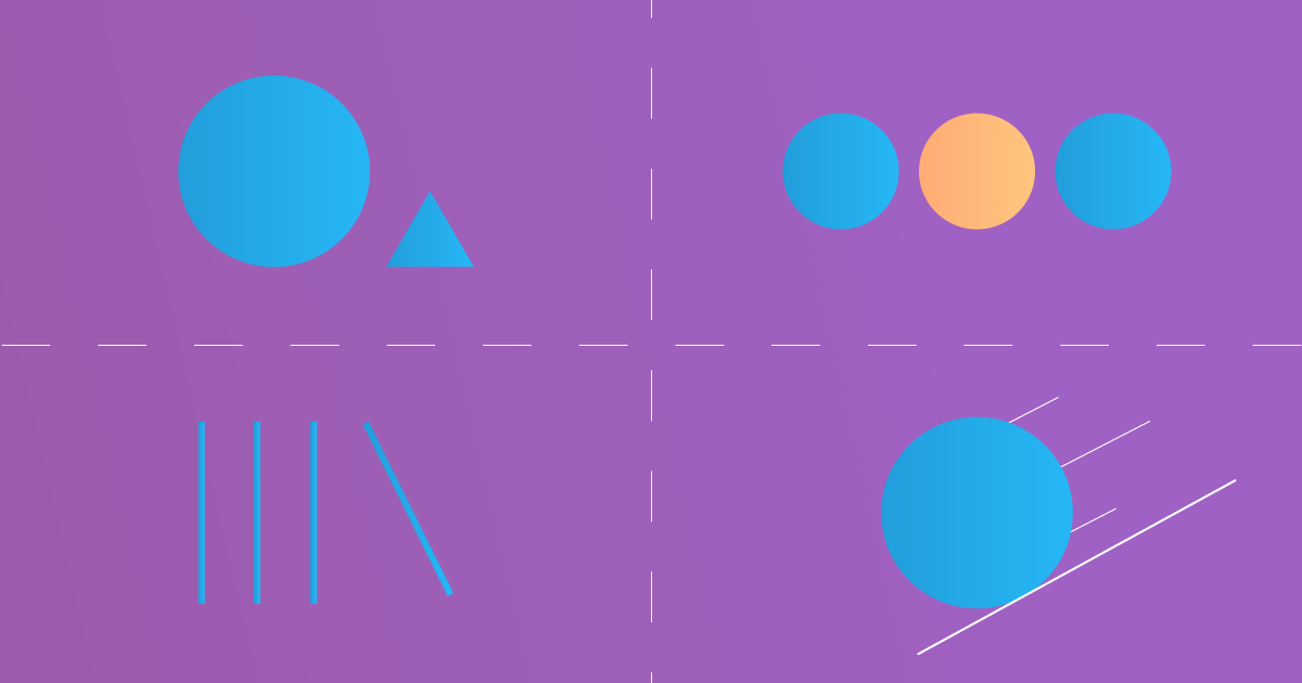
Our visual cortex has four “pre-attention” areas – V1, V2, V3, and V4. These areas are dedicated to very small and specific visual elements: size & shape, color, orientation, movement.
- Size & Shape: if one object is either of a different shape or of a different size, then it gets noticed straight away. Whether it is more effective to differentiate the desired object by making it bigger, or smaller depends on the context, type of the object, and the intention. Similarly, whether it is better to use angular, or circular shapes depends on the context. However, regardless of the choice of the element, the viewer will certainly notice the difference.
- Color: if one object has a different color than the ones around it, then it captures attention immediately. Imagine a designer creates a landing page of product bundles that are intended to emphasize the advantages of one of the packages for which the company wants to have higher demand. The bundle can be colored differently to emphasize the benefits. The choice of color can be strategic as well.
- Orientation: if one object has an orientation that contradicts that of the others, then it grabs attention right away. If the visual portrays multiple similar objects, orienting the object differently will emphasize its “uniqueness”. This will grab the viewer’s attention.
Movement: if one object suddenly zooms in from small size and gradually gets larger (think a lion running towards you), that catches the viewer’s attention.
The bottom line: When creating functional landing pages, designers and marketers can take advantage of certain properties of the human brain to design effective interfaces. Simply by keeping in mind the specifics of “pre-attention” areas of the human brain and by acknowledging the existence of the fusiform facial area, the designers can make strategic decisions about how to emphasize the information or target objects, so that it grabs the viewer’s attention. That said, interface designers should resist the urge of using multiple methods at once (e.g. a face, and color, and size, and shape, and orientation). It may prove counterproductive – the balance will be distorted, the users will be confused, thus, they will take no action.


