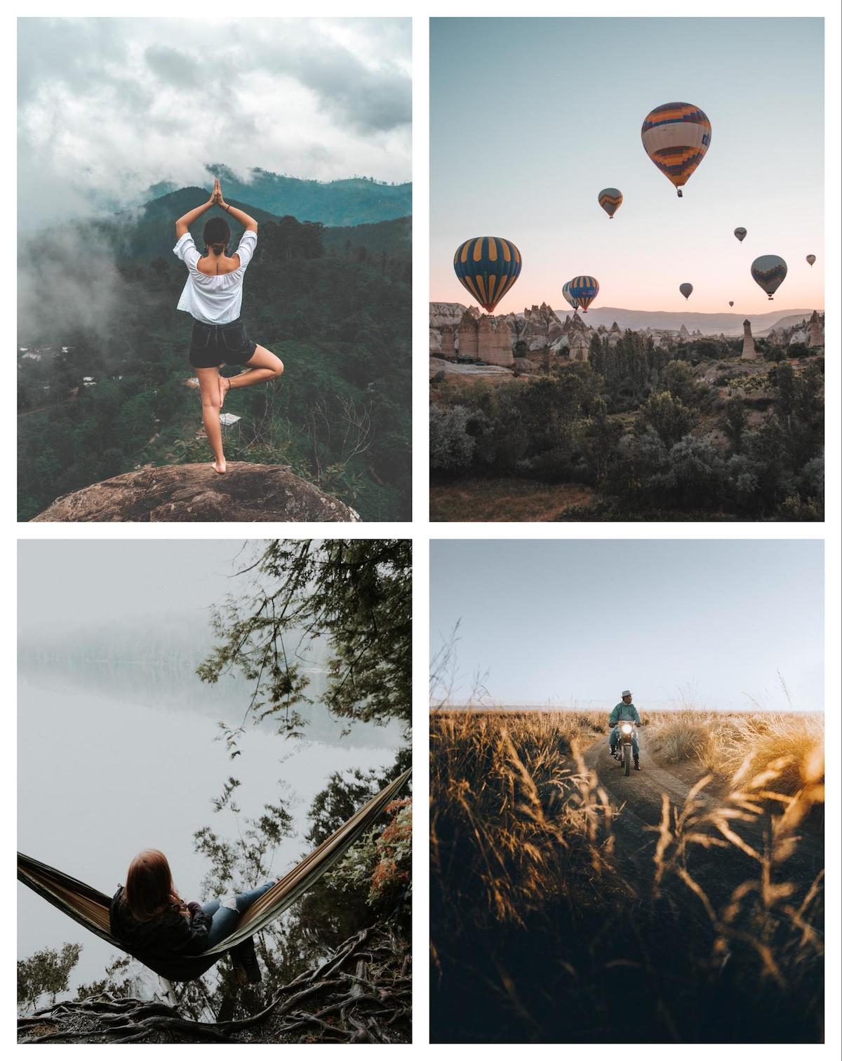
“There are three responses to a piece of design – yes, no, and WOW! Wow is the one to aim for.”- Milton Glaser
But how to reach the WOW effect? That’s the question.
If you are looking for a way to reach that outstanding reaction from your audience and modernize your business, one way to do so is to get introduced to the trends in graphic design, that will take your company’s image to a whole another level.
Looking forward to the world of design for 2020 one thing is obvious, unlike the previous years, the upcoming year will contain more reserved, natural, and harmonious designs. This shift presumably is due to the overuse of some of the bold graphic design trends from the previous years.
To stay ahead of the curve, find out the ultimate trends for the world of graphic design 2020 below. Let’s go!
1. Muted Color Palettes
The upcoming year will bring an intensive use of muted colors, the ones that have been slightly desaturated with black, white, or a complementary color.
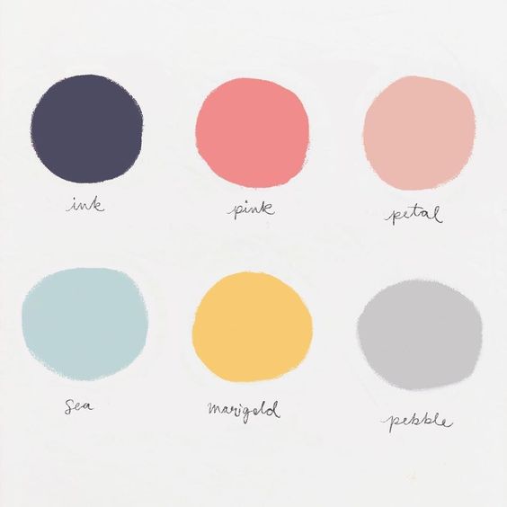
It seems that designers are taking a step back from the popular use of vivid, bright, and bold color palettes. This does not mean that we will have a shortage of interesting color palette combinations in any of the graphics of the upcoming year. The year will still be a promising one with a lot of remarkable color combinations and contrasts. The color-use will just be comparably reserved across the board.
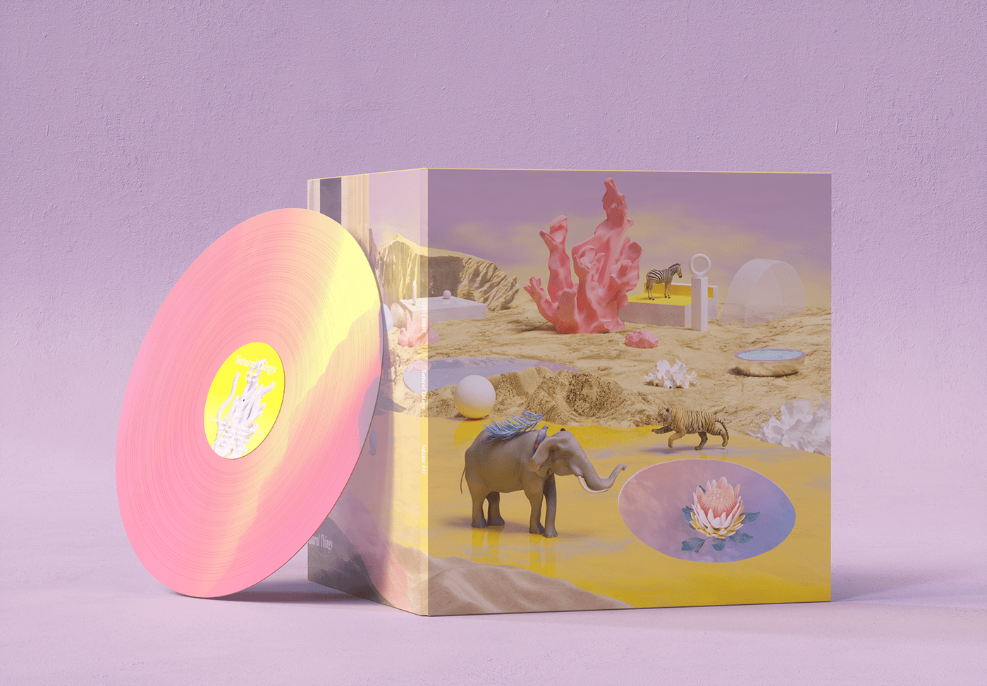
Many brands are already integrating the trend in their current designs. Companies like LinkedIn have already done outstanding work towards the muted color design use.

2. Color Gradients
Color gradients are going to be another important trend of 2020. They have been going pretty strong for already several years in a row and they will certainly be in the trend for the upcoming year, as well. However, each year it seems, that through designers’ creativity gradients find a new way of use in common designs. Fortunately, instead of being the central point, gradients will be strategically used to be the elements that will help to elevate the graphics and make them stand out.
Gradients are finding life throughout the design world for another year, 2020!

There are so many brands and companies that previously stood out with their use of color gradients. A great example can be Trello, as they use gradients to accentuate their blog headers and social graphics.
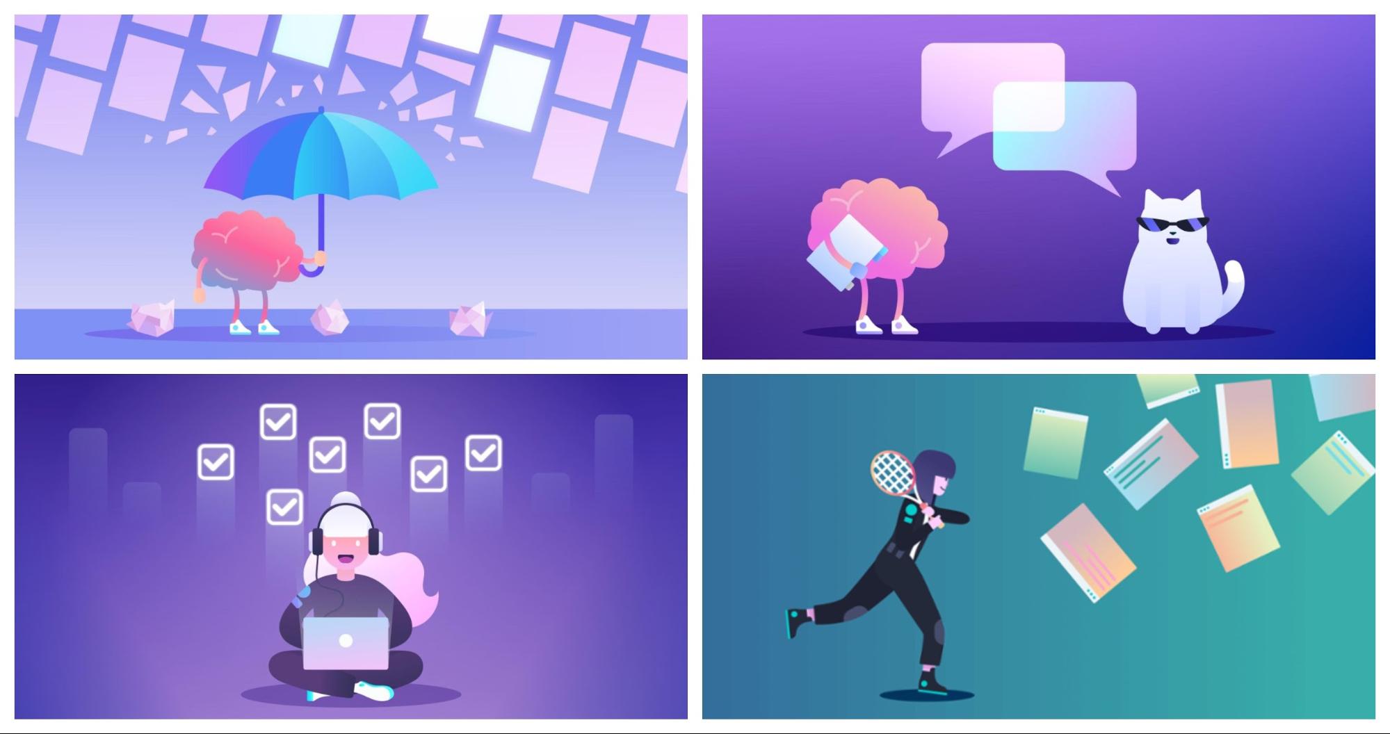
3. Abstract and Dreamy Illustrations
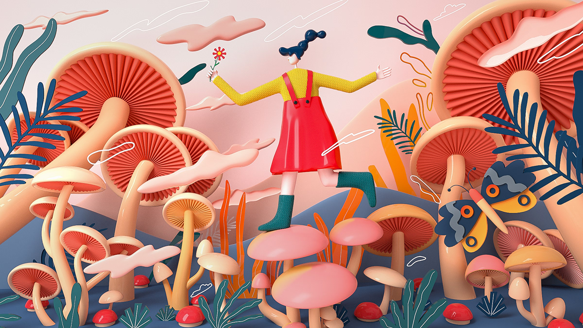
In the creative world of graphic design, it seems that simple illustrations are losing their place to the more eye-catching dreamy illustrations that are our next trend for 2020. These illustrations will help your company to stand out against a crowd of stock photos and low effort graphics. If your ultimate goal as a creative agency is to stand out in the market, make a wise choice and embrace as many abstract, imaginative, and dreamy illustrations as possible for 2020.

Simultaneously, abstract illustrations are just another creative way that designers are trying to move away from everyday simple and realistic illustrations. With an attempt to stand above the noise.
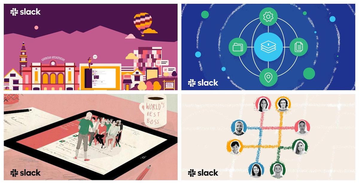
Slack is just one of the outstanding examples of how effective this trend could be.
4. Heavy But Simple Fonts
Heading into 2020 trends, and next is the use of heavy but simple fonts that will dominate the world of design for the upcoming year. Being able to intelligently use the font types in any design you conduct is another art form that needs a thorough examination of your brand’s image. The use of heavy but at the same time unique looking and simple fonts will lead us through every design we will see in the upcoming year. To be able to intelligently and tastefully integrate it to your own brand be careful to not overuse or over-exaggerate it though.

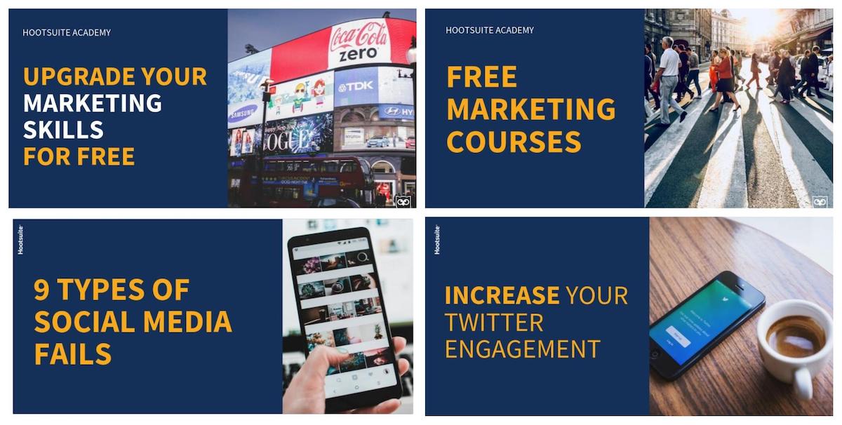
Those fonts are typically extra bold or bold fonts, which automatically gives them “heavy” appearance. The use of these fonts will give your brand an image of modern, contemporary, and up to date looking company. Their use has a great potential of becoming the focal point of most of your graphics. This is especially true for social media designs, as you specifically have to be more aware and worried about spreading and getting your message across as quickly and efficiently as possible. Heavy fonts are a great solution to reach all these!
A great example of the use of heavy fonts can be seen in Hootsuite’s case below.
5. Natural and Genuine Stock Photos
Yet again this year we will observe another contrast between the trends in graphic design from the previous years. We have been a witness of how years earlier bright, and colorful stock images became highly popular. Designers were taking some risks with strong choices in saturation or boosting colors.
But as the taste and the trend for color choices change, correspondingly the trend for stock photos follows it quickly. This means, that we can wait for more muted, natural, real looking, and genuine stock photos in the 2020 graphic design world.
