“Websites promote you 24/7: No employee will do that.”
Having an effective website is an essential component of your brand’s success. A clear message, outstanding visuals, and strategic structure are all components that make a difference in the interaction of a user visiting the page. If you have a website one of your strategic objectives should be to create a conversion machine, which will allow converting prospective visitors into interested leads who will later become customers. But before reaching that stage you, first of all, have to evaluate your visitors’ interest. One of the indicators of audiences’ interest in your website and brand, in general, is, of course, the time spent on the actual page. Here is when the concept of “ bounce rate” enters the game.
Bounce Rate:
To put it short and precise, your website’s bounce rate can be defined as the metric indicating the percentage of the visitors who land on your page and leave it without clicking to any other age in the site. To put it differently, the bounce rate of a webpage is related to single-page visitors. Consequently, if the visitors of your website bounce, it can suggest that they were either confused about finding the information they needed or the page was not user-friendly. This leads us to the discussion of the importance of bounce rate and what are the ways you can adjust it to your strategic needs.
Why care about bounce rate?

The bounce rate of your website is simply the indicator of the audience’s interest and interaction with the content presented. If they are not spending time on your website, digesting the information available, it could be an alert to detrimental website choices that affect your brand’s image and overall relationship with the potential and current customers.
So, let’s dig deep into the land of bounce rate and the ways you can make a significant change in reducing it.
Reduce load time:
The longer your page keeps loading, the more you are testing your visitors’ patience. But nobody is as impatient as the average internet user who wants to get information to their fingertips without any avert, delay; instantly. Moreover, in a world of heavy competition websites providing similar information, users would prefer easier access to the other available information from your competitors rather than wait for your site to finish loading.
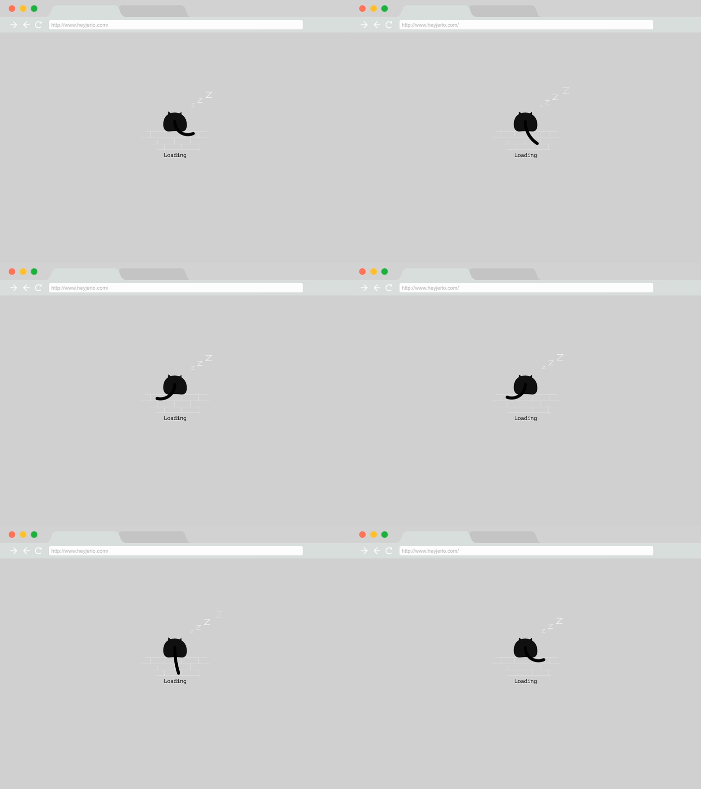
Thus, if you want to improve your audiences’ interaction with your website, first of all of work to improve it’s loading time and other technical shortcomings; get rid of any excessive widgets, heavy scripts, plugins, and optimize the code for the page and the images.
Attract the right target visitors:
If people revisiting to your website but only view a single page, chances are high you are not targeting the right visitors who will be interested in the content provided. By promoting your website in communities and channels that concentrate specifically on your customer type, you can automatically eliminate the amount of “random” people visiting your page and discover they are not in the right place with the content they are not interested in. Thus, decent customer segmentation, profiling, and targeting can have an enormous effect on the decrement of your website’s bounce rate and the percentage of hits from your desired audience.

Improve Usability:
A good website has to have a strategic separation and representation of the content, that would be easily readable and accessible to a visitor. With having large headlines, separating the most critical content from the others with the use of bullet points, larger fonts, good color contrast, and white space, you are influencing visitors subconscious perception leading them to pay attention to the aspect you want to, and making it easier for him to navigate through the oceans on the information.
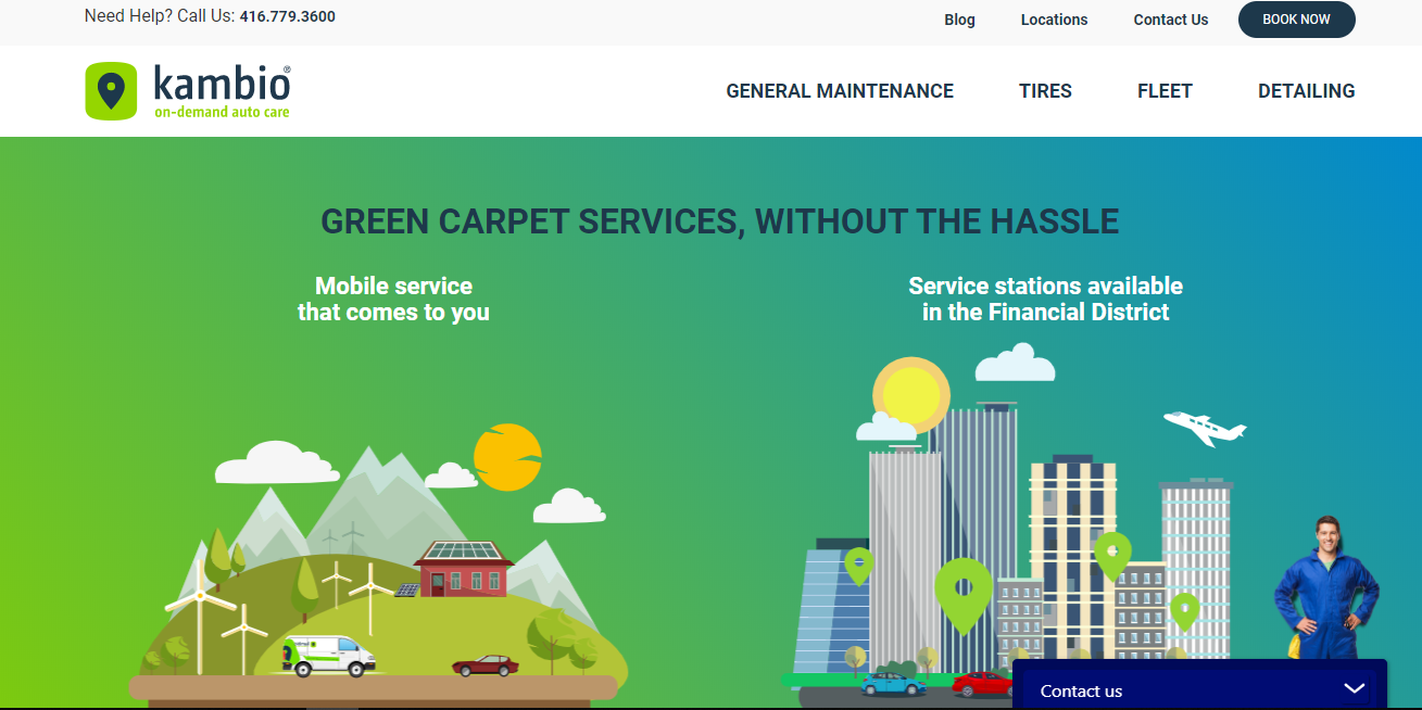
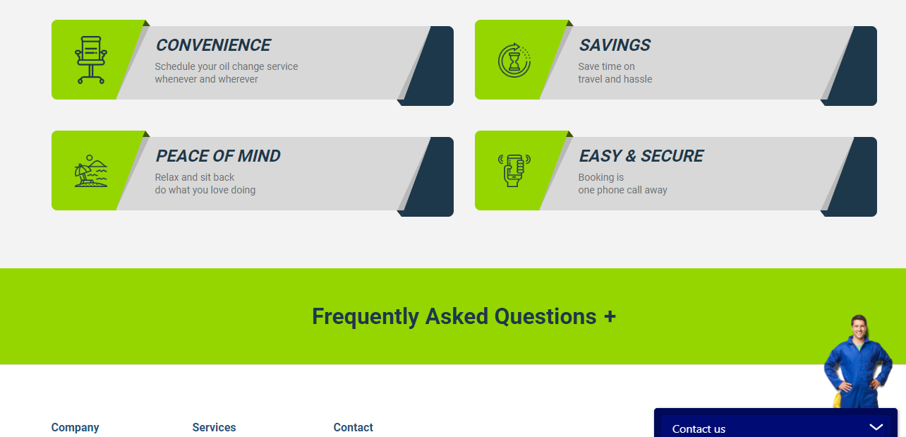
Besides, your website can have a high bounce rate, simply because of monotonous and dull design, which is not attractive and is even distractive for visitors’ eyes. Let’s take an example from one of our previous works. When working on the website of one of our partners, Kambio, we were facing the challenge of making the final product more readable. Thus, our concentration was readability, which refers to the practice of delivering the write-up in a way that enhances the ease of reading.
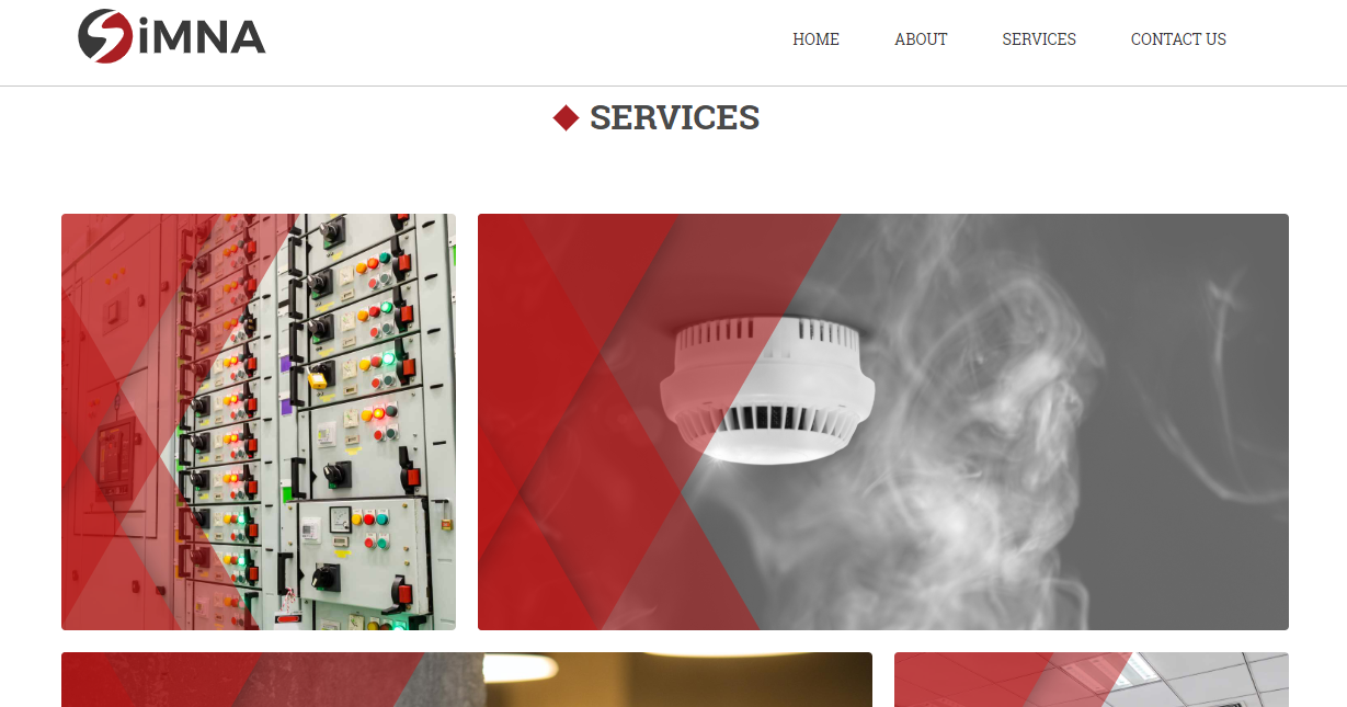
Working on another project, for Simna, we spiced it up with some color combination the division of the content with corresponding visuals to make the website as engaging as possible. We also had a very attentive choice with the legibility of the text. Through the attention to detail and the thorough analysis of their content, we tried to bring a visual balance of the text to be as user-friendly as possible.
Tip from Digilite: Do not make the text way too small that it will cause a headache to read, or way too big that it would look childish or unprofessional. Work on finding the perfect balance.
Provide Quality Content:
Last but not list, if you are not providing with the right and quality content to your page visitors, chances are high they will not stick around for a long time wondering what the page is about or how it can relate and help them. Work on the content type of your site, integrate some relatable visuals, work on the coherent flow of your pages, and you will witness an immediate result in your bounce rate. Let’s take another example from our work.
When working with Corning Centre, we strategically chose the separation of the content and the content type and placement on the final website. The website now contains corresponding visuals, a separate section for newsfeed, and a calendar that make it easier for the user to navigate through the page.
