Let’s talk about the call to action.
Want more email subscribers? Contest entries? Conversions?
You won’t get them without the right call to action.
What is a Call To Action?
Did you download Dropbox, Spotify or have you ever signed up for things in your life?
Each one of these signups is 90% a result of an effective call-to-action (CTA).
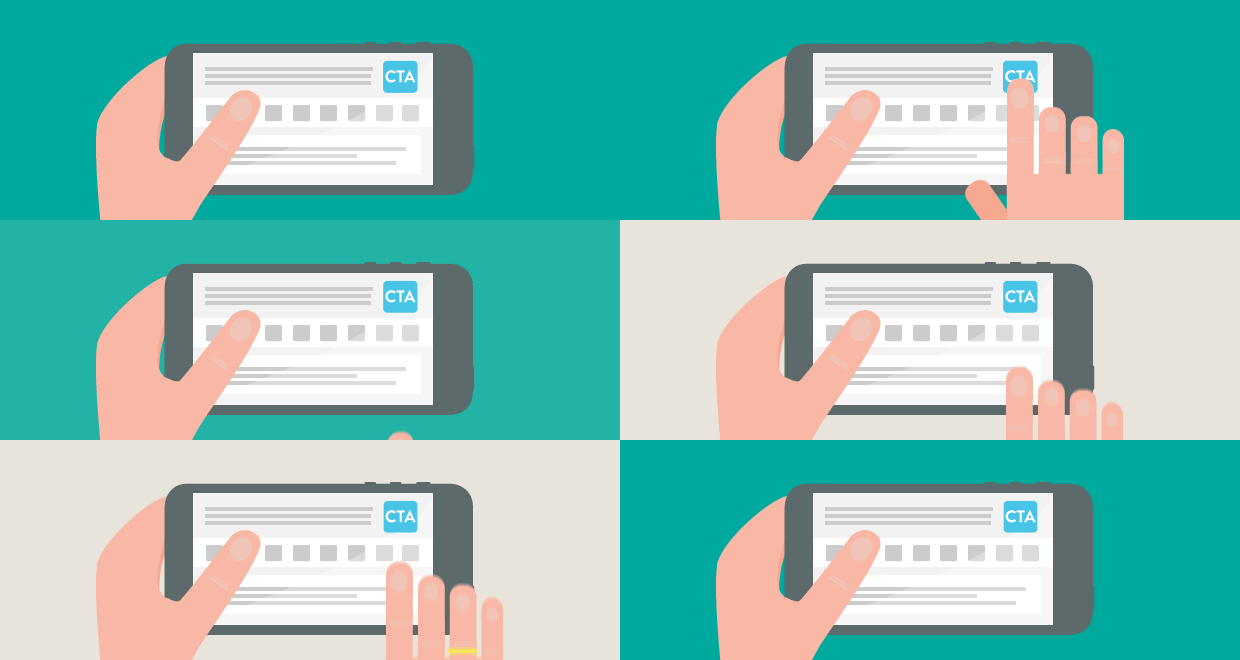
Call to Action is a piece of content intended to persuade a user to perform a specific task — which might be purchasing your product, signing up for your newsletter, or clicking through to a landing page.
To help you identify what’s effective, we have collected totally rocking CTAs.
1. Evernote
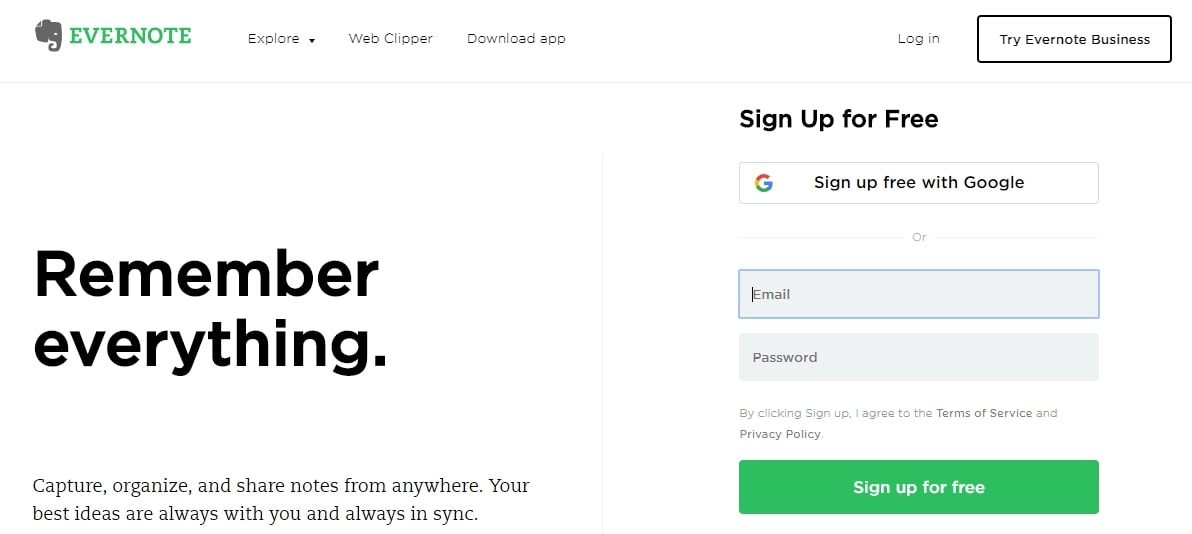
CTA button: Sign up for free
“Remember Everything.” Visitors can immediately understand that message the moment they land on this page.
Also, pay attention to the CTA button color, it is the same green as the logo and the headline.
2. OfficeVibe
CTA Button: Subscribe
Here’s a slide-in call-to-action that caught my attention from OfficeVibe.

3. Netflix
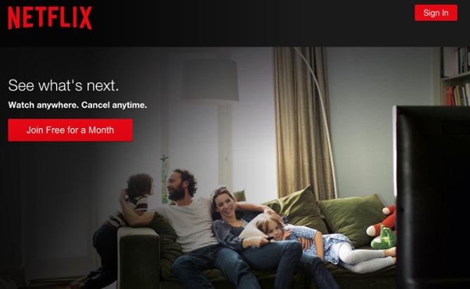
CTA Button: Join Free for a Month
One big fear users have before committing to sign up for something. That it’ll be hard to cancel their subscription if they end up not liking it. Netflix takes that fear away in the bud with the “Cancel anytime” copy right above the “Join Free for a Month” CTA. Bet, that reassurance alone has boosted signups. Also, you’ll notice again that the red color of the primary and secondary CTAs here match Netflix’s logo color.
4. Square
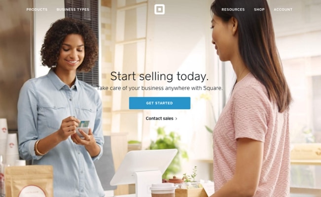
CTA Button: Get Started
Mindful of these additional design components, the folks at Square used a single image to showcase the simplicity of using their product, where the hovering “Get Started” CTA awaits your click. If you look closely, the color of the credit card in the image and the color of the CTA button match, which helps the viewer connect the dots of what to expect if/when they click.
5. Prezi
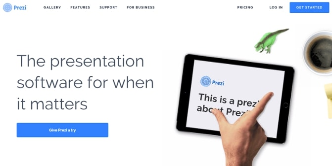
CTA Button: Give Prezi a try
The folks at Prezi are also into the minimalist design.
That bright blue is strategically placed on the homepage: the main “Give Prezi a try” CTA, and the secondary “Get Started” CTA, both of which take users to the same pricing page.
6. Full Bundle
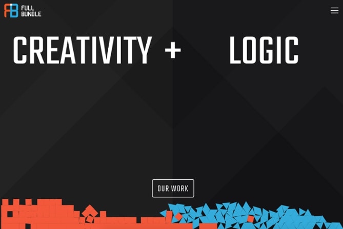
CTA Button: Our Work
Full Bundle is another company that uses negative space to make their primary CTA pop. The white “Our Work” call-to-action stands out against the dark greys of the background. Their choice of CTA is strategic, too. Given that they primarily exist to build out clients’ online presences, it’s important for them to showcase their work — and that’s what most folks are going to their website for.
7. Huemor
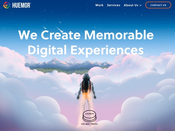
CTA Phrase: ‘Launch (Do Not Press)’
If you went to a website and saw a “Launch” CTA accompanied by the copy “Do Not Press” … what would you do? Let’s be honest: You’d be dying to press it. The use of harmless reverse psychology here is playful, which is very much in keeping with Huemor’s brand voice.
8. Toms
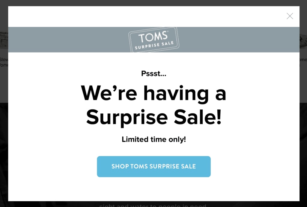
CTA Phrase: Shop Tom’s surprise sale.
Toms was recently having a flash sale. Or, as they put it in their popup, a “surprise sale.”
9. VoiceNation
CTA Phrase: Experience the Difference.
VoiceNation makes their call to action about you. You deserve more. The best. And now, you can experience the difference.

10. Suntrust
CTA Phrase: Confidence starts here.
Suntrust’s call to action does something a little bit different that likely wouldn’t work for a lot of businesses, but it works for them.
They start with a negative in the form of a problem, saying “you can’t buy financial confidence.” They then immediately offer themselves as a solution with “but you can build it up at onUp.com.”
Problem/solution selling is a highly effective sales technique and it works, here, too.
The CTA button is what’s so unique. They say “Confidence Starts Here” instead of “Start Building Confidence Here.”

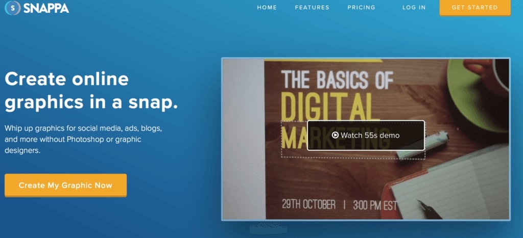
11. Snappa
CTA Phrase: Create my graphic now.
It’s not much of a surprise that graphic design software Snappa has a perfectly-crafted call to action.
Since this is on a landing page, they put a brief introduction into the tool in between these two lines, explaining more about the service to strengthen the call to action.
12. MOO
CTA Phrase: Order a free sample pack
MOO has outstanding business cards, and their quality is second to none.

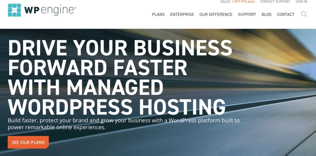
13. WordPressEngine
CTA Phrase: See our plans.
This call to action is big and in-your-face, but it’s clear. It uses strong action verbs like “drive,” “build,” “protect,” “grow,” and “power.”
They also smartly chose “See Our Plans” instead of pushing for an immediate signup.
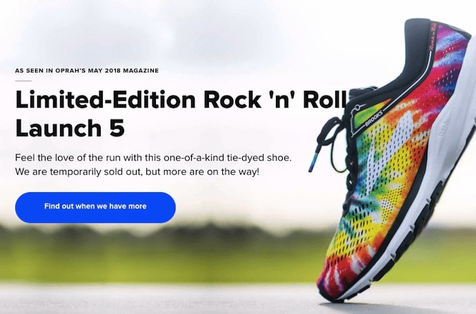
14. Brooks Running
CTA Phrase: ‘Find out when we have more’
How many times have you hotly pursued a product you love, only to discover it’s sold out? Well, as you might know, it’s no picnic for the seller either. But just because you’ve run out of an item doesn’t mean you should stop promoting it.
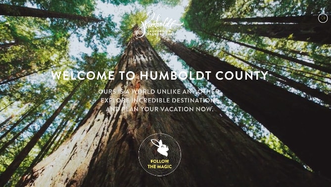
15. Humboldt County
CTA Phrase: ‘Follow the Magic’
The call to action button enhances the sort of fantastical feel of the footage, making you feel like you’re about to step into a fairytale.
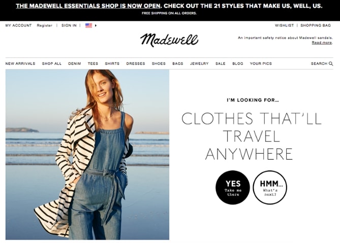
16. Madewell
CTA Buttons: Take me there | What’s next?
When you first arrive on the page, you’re greeted with the headline “I’m Looking For …” followed by a category, like “Clothes That’ll Travel Anywhere.” Below this copy are two options: “Yes, Take Me There” or “Hmm… What’s Next?” The user can choose between the two CTAs to either browse clothes that are good for travel, or be taken to the next type of clothing, where they can play again.
As for any conversion rate optimization tips, it’s important to A/B test your crafted CTAs on your own site and see what works best for your audience.
Having a strong, intentional, well-crafted call to action will breathe new life into your campaigns, but not having one could sink even the best content.
What do you think? Which do you think are the best call to action examples?
The examples were taken from hubspot and adespresso.


